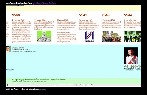
โดย ศูนย์ข้อมูลนักการเมืองไทย ThaisWatch.com
[via @iPattt]
technorati tags: Thailand, politics, timeline, visualization

[via @iPattt]
technorati tags: Thailand, politics, timeline, visualization
from Tactical Technology Collective:
Ubuntu Eee ใช้คอมพิวเตอร์เครื่องเล็กให้คุ้มค่า
History of Graphic Design 2008 ความเป็นมาของการออกแบบกราฟิกจนถึงปัจจุบัน
Design Matrix of the 20th Century (industrial design) ใครอะไรที่ไหนในแวดวงออกแบบอุตสาหกรรม
technorati tags: design+history, tactical technology, information design
From the creator of jQuery, Processing.js brings Processing visualization language to JavaScript/DHTML platform.
And for jQuery developers, try this Visual jQuery, an easy access jQuery API documentation.
ลองเล่นดูนะครับ Processing บน JavaScript ตอนรันพวกเดโมต่าง ๆ นี่ ซีพียูอาจจะพุ่งกว่าปกติซะหน่อย แต่ก็เหมือนกับพวกเว็บ AJAX ทั่วไปครับ — ผมว่า JavaScript/DOM engine ของเว็บเบราว์เซอร์ในปัจจุบัน มันถูกใช้งานจนเกินขีดจำกัดของมันแล้ว คือตอนนั้นที่ออกแบบไม่ได้มีใครคิดว่ามันจะถูกนำมาใช้สำหรับงาน Rich Internet Application ที่มีภาพออบเจกต์ มีการโต้ตอบเยอะขนาดนี้ โครงการเว็บเบราว์เซอร์รุ่นใหม่ ๆ ก็เห็นจุดนี้และพยายามปรับปรุงประสิทธิภาพของ JavaScript engine และเพิ่มฟังก์ชันที่ถูกเรียกใช้บ่อย ๆ (เช่นการค้น/เลือก element ด้วย class) เข้าไปเป็น API มาตรฐาน (แบบเป็น native ไม่ต้องไปอิมพลีเมนต์เองด้วย JavaScript ซึ่งก็จะทำให้ประสิทธิภาพดีขึ้น)
และสำหรับคนที่สนใจ Processing แนะนำบล็อกนี้ครับ Pongpan Suriyapat มีเรื่อง Processing และ new media art / interaction design น่าสนใจอยู่เรื่อย ๆ
technorati tags: jQuery, Processing.js, Processing
ซอฟต์แวร์สำหรับทำ mind mapping/concept mapping นี่มีเยอะมาก
ที่เป็นซอฟต์แวร์เสรีก็เยอะ หรือที่เป็นฟรีแวร์ (แต่ไม่เปิดซอร์สโค้ด) ก็เยอะเช่นกัน
ลองไปดูได้ที่: WP: list of mind mapping software
ตัวที่นิยมใช้กันแพร่หลายในประเทศไทย คือ FreeMind เป็นซอฟต์แวร์เสรี ที่เปิดให้เอาไปใช้เอาไปแก้ไขเพิ่มเติมได้โดยเสรี ไม่เสียค่าใช้จ่ายใด ๆ ใช้ได้กับหลายระบบปฏิบัติการ ทั้ง Windows, Mac OS X, GNU/Linux ฯลฯ (เป็นจาวา) — อธิบายสรรพคุณ / ดาวน์โหลด / mk: วิธีติดตั้งสำหรับคนใช้ลีนุกซ์ Ubuntu
ส่วนโปรแกรม Semantik (เดิมชื่อ Kdissert) ก็น่าสนใจสำหรับคนที่อยากจะทำเอกสาร ทำรายงาน โดยใช้ mind map เป็นเครื่องมือ โดยมันสามารถสร้างเอกสารจากแผนที่ความคิดให้เราได้ด้วย (pdf, latex, odt, txt, html) เจ๋งดี (ตัวนี้เป็น Python/Qt)
ส่วนใครใช้ Ubuntu อยู่จะลง Kdissert จาก apt-get/Synaptic เลยก็ได้ (แต่จะเป็นรุ่นเก่ากว่า)
แนวความคิดเรื่อง “mind map”/“concept map” หรือ “แผ่นที่ความคิด” นี้ เป็นแนวความคิดที่ใช้กันมานานแล้ว หลายศตวรรษ โดยวิกิพีเดียยกตัวอย่างงานของ Porphyry of Tyros นักคิดคนสำคัญในคริสตศตวรรษที่ 3 (ราว 1,700 ปีก่อน):
Mind maps (or similar concepts) have been used for centuries, for learning, brainstorming, memory, visual thinking, and problem solving by educators, engineers, psychologists and people in general. Some of the earliest examples of mind maps were developed by Porphyry of Tyros, a noted thinker of the 3rd century as he graphically visualised the concept categories of Aristotle. Ramon Llull also used these structures of the mind map form.
สำหรับตัวอย่างของไทย อันหนึ่งน่าจะเป็นงานของท่านพุทธทาส ดังภาพนี้:
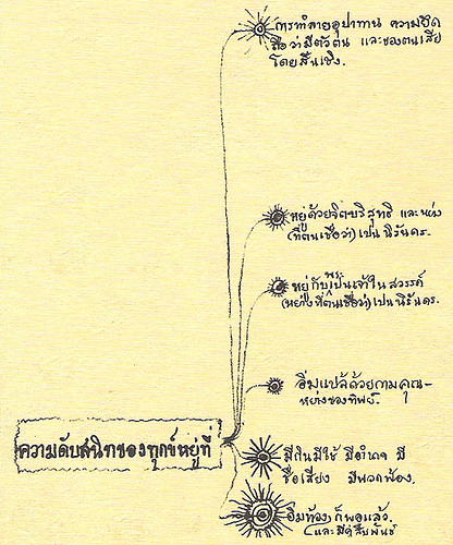
(จากหนังสือ พุทธทาสลิขิตข้อธรรม บันทึก นึกได้เอง ผังนี้ท่านพุทธทาสบันทึกไว้เมื่อ พ.ศ. 2495)
ใครสนใจเรื่อง data visualization ลองไปดู
Milestones in the History of
Thematic Cartography, Statistical Graphics, and Data Visualization
มีภาพและผังต่าง ๆ เยอะมาก แสดงวิวัฒนาการและการพัฒนาในสาขานี้ น่าสนใจมาก (ลิงก์จากคุณคนชายขอบ – ขอบคุณครับ)
technorati tags: free software, mind mapping, FreeMind
prefuse, visualization library สำหรับจาวา, ออกรุ่น beta release 2007.10.21 แล้วนะครับ
และไล่ ๆ กัน ก็มีไลบรารีน้องใหม่ ชื่อ prefuse flare ออกมาด้วย เป็น visualization library เหมือนกัน แต่อันนี้สำหรับ Flash/ActionScript 3
ใครทำด้าน information visualization ก็ได้ลองดูได้
technorati tags: Java, ActionScript, visualization
“Given enough eyeballs, all bugs are shallow.”
แต่ก่อนอื่น ต้องทำให้มัน มองเห็น ให้ได้ก่อน
Many Eyes ซอฟต์แวร์จากไอบีเอ็ม จะช่วยทำให้คุณ ‘เห็น’ ข้อมูล (visualization)
ลองเข้าไปเล่นดู ส่งข้อมูลเข้าไป แล้วให้มันแสดงเป็นภาพออกมาได้เลย
[ลิงก์ Many Eyes| ผ่าน iTeau's Dirt]
technorati tags: information visualization
Knowledge Maps of Researchers and Methods in the Visualization Field
แผนที่ความรู้แสดงนักวิจัยและระเบียบวิธี ในสาขา “การมองภาพ” (visualization*)
ในนั้นมีอันนึงที่น่าสนใจมาก สรุประเบียบวิธีในกาำรทำ visualization (ใช้อังกฤษไปก่อนนะ) ในตารางแบบตารางธาตุ:
A Periodic Table of Visualization Methods
พร้อมกับบทความวิชาการ พูดถึงเรื่อง จะเอาตารางนี้ไปช่วยการจัดการได้อย่างไร ?
ทั้งหมดนี้ จัดทำโดย Visual-Literacy.org ซึ่งเป็นหลักสูตรอีเลิร์นนิ่ง สำหรับประกอบหลักสูตร 14 หลักสูตร ใน 4 มหาวิทยาลัย (ทั้งหมดในสวิตเซอร์แลนด์) โดยหลักสูตรเหล่านั้น ต้องการทักษะการวิเคราะห์และการสร้างกรอบความคิดชั้นสูง เพื่อที่จะเปลี่ยนสิ่งที่เป็นนามธรรมออกมาเป็นแผนภาพที่จับต้องได้ และเพื่อจัดการความซับซ้อนของหัวข้อและปัญหาที่สนใจในแต่ละหลักสูตร โดยหลักสูตรเหล่านี้มีตั้งแต่ การจัดการความรู้ ไปจนถึง วิศวกรรมซอฟต์แวร์
* visualization จะแปลว่าไรดี ?
Lexitron แปลว่า “การมองเห็น” แต่นี่เรากำลังพูดถึง “การทำให้มองเห็น” อยู่มากกว่ารึเปล่า ?
visual arts นี่ ทัศนศิลป์ .. visual คือ ทัศน์ (เหมือนใน ทิวทัศน์)
งั้น visualization การทำให้เกิดทัศน์ (สร้างภาพ :P) เอาเป็น “ทัศนประดิืษฐ์” ไหวมั๊ย ? ตรง/ได้ความหมาย รึเปล่า ? หรือเลียน โลกาภิวัตน์ เป็น “ทัศนาภิวัตน์” ดี :P
ค้นเน็ต เจอที่ม.เกษตร ใช้คำว่า “ทัศนสารสนเทศ” สำหรับคำว่า “information visualization” .. เอ แต่แบบนั้นมันไม่ใช่ “visual information” เหรอ ?
ยังไงดี
(เมื่อก่อนพยายามใช้คำง่าย ๆ บ้าน ๆ แต่หลัง ๆ รู้สึกว่า มันทำให้ความหมายสูญเสียได้ง่าย อย่างคำว่า new media ถ้าแปลเป็น “สื่อใหม่” งั้น ... นสพ.ฉบับใหม่เป็นสื่อใหม่มั๊ย ?)
technorati tags: information visualization
แผนที่แนวโน้มเว็บ พ.ศ. 2550 โดย Information Architects Japan

น่าสนใจดี ปีนี้จะมีอะไรสนุก ๆ มาให้เล่นให้ทำกันอีก :)
ดู สีและเส้น แล้วนึกถึง แผนที่รถไฟใต้ดินลอนดอน
[ลิงก์ iA Tokyo | ผ่าน keng.ws]
technorati tags: web, trend, map, information visualization
เผื่อใครอยากจะเขียนโปรแกรม วาดผัง ร่องรอย blog tag (ตัวอย่าง โดย keng)
ลอง Java libraries for open source graph/network visualization
technorati tags: information visualization, graph, network, Java
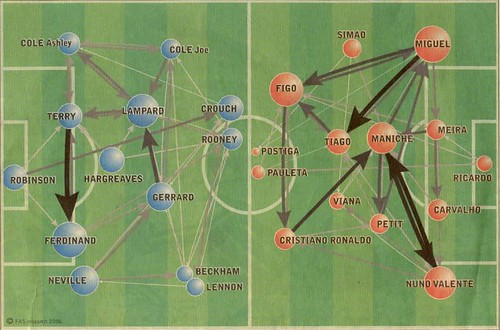
วาดข้อมูล แสดงคุณภาพเครือข่ายในสนามฟุตบอล โดยแสดงเส้นทาง (path) ของลูกฟุตบอลระหว่างตำแหน่งต่าง ๆ ในสนาม จากรูปข้างบน ซึ่งเป็นเกมฟุตบอลโลก 2006 คู่ อังกฤษ-โปรตุเกส เราจะเห็นได้ชัดว่า บอลทางฝั่งอังกฤษจะวิ่งไปมาอยู่กลางสนาม คือจาก เทอร์รี่ (กองหลังตัวกลาง) ไป เฟอร์ดินานด์ (กองหลังตัวกลาง) และจาก เจอร์ราร์ด (กองกลางตัวกลาง) ไป แลมพาร์ด (กองกลางตัวกลาง)
ดูภาพวิเคราะห์อื่น ๆ ได้ที่ Network Analysis and the soccer worldcup ที่ FAS.research
[ลิงก์ fas.at | ผ่าน information aesthetics, pasta and vinegar]
tags: football | network analysis | information visualization
A great presentation that shows the power of information visualization and how computer technology and good design could deliver a better understanding of the world situation to its dwellers:
Ideas Worth Spreading: Hans Rosling from TED 2006
นำเสนอเจ๋งดี นี่คืออีกอย่างที่อยากทำ infovis นำเสนอข้อมูลจำนวนมาก ให้เข้าใจได้ง่าย ๆ ประชาชนทั่วไปจะได้สามารถเข้าถึงและเข้าใจได้ อันจะนำไปสู่สังคมความรู้ และที่หวังก็คือเป็น “informed voters” ผู้ลงคะแนนเลือกตั้งที่ได้รับข่าวสารอย่างเพียงพอ
ป.ล. อัพ รุ่น PDF ของสไลด์ อนาคต+โอเพนซอร์ส+ไทย — 20 อย่างที่พอนึกออก แล้วนะ
tags: information visualization | information | visualization | presentation | infovis
+1 paper:
Less is more: probabilistic models for retrieving fewer relevant documents (pdf)
by Harr Chen & David R. Karger, MIT CSAIL
tags: data mining | natural language processing | data visualization | information retrieval
International Networks Archive
“What does a globalized world look like?”
แสดง "โลกาภิวัฒน์" ใน ผัง ภาพ แผนภูมิ และแผนที่ที่ไม่ใช่ภูมิศาสตร์ (non-geographic maps)
// infographics / maps / interactive maps
INA เป็นโครงการความร่วมมือโดยกลุ่มคนหลายคนจากหลายประเทศ (โดยมากก็เป็นอาจารย์มหาวิทยาลัย) นำโดยกลุ่มอาจารย์ที่ภาควิชาสังคมวิทยา มหาวิทยาลัยพรินซ์ตัน
ถ้าบ้านเรามีคนทำเรื่องแนว ๆ นี้บ้าง พวก information design, data visualization แล้วลองหยิบเอาข้อมูลประเด็นการเมือง เศรษฐกิจ วัฒนธรรม มานำเสนอดู ให้ดูง่าย ย่อยสะดวก เข้าใจทันที แบบคนทั่วไปเห็นแล้วร้อง อ๋อ ... เราจะเข้าสู่สังคมฐานความรู้ได้เร็วขึ้นรึเปล่า ?
แบบ ไอ้ที่ว่าโกงเนี่ย มันโกงยังไงเหรอ เมื่อก่อนไม่เห็นภาพ ตอนนี้ก็วาด(ความหมายตรงตัว)ให้เห็นซะเลย
via anpanpon
tags: information graphics | data visualization | mapping | information design
ผังภาพ แผนภูมิ เกี่ยวกับความขัดแย้งอิสราเอล-เลบานอน
info aesthetics .. visualizing the 2006 Israel-Lebanon conflict
middle east ceasefire infographic
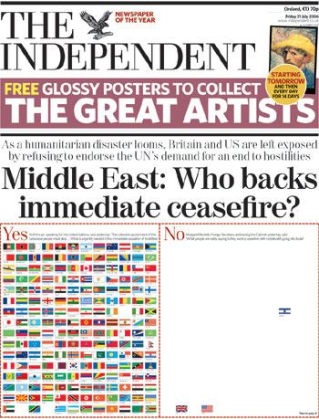
The Independent (UK newspaper) frontpage.
“That message would take up less space as words, but somehow the impact wouldn't be quite the same.” — kotke.org
israeli/lebanese coffin counter
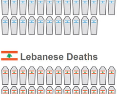
Captured from moiz.ca.
“a simple, repetitive diagram that visualizes the proportionality of deaths in the on-going conflict between Isreal & Lebanon. each coffin represents a single person killed.” — infosthetics.com
More mideast conflict infographics:

tags: information, design, information design, aesthetics, Israel, Lebanon, conflict
Websites as graphs — visualize a website as a graph (tree), each node represents one HTML tag.
See your website graph ลองดู ๆ
tags: graph tree website HTML visualization
YALE YALE - Yet Another Learning Environment?
ถ้าใครรู้จัก Weka .. นั่นแหละ มันคือประมาณ Weka แหละ (ซอฟต์แวร์สำหรับเอาไว้ทดลอง การเรียนรู้ของเครื่อง / การทำเหมืองข้อมูล) แต่ดูสดกว่า คงเพราะมาทีหลัง มีเครื่องมืออำนวยความสะดวกเพิ่มเติมจากที่ Weka มี อย่างตัวเลือก feature หรือเรื่อง XML อ้อ ใช้ตัว classifier/clusterer ของ Weka ใน YALE ได้ด้วยนะ อ่านฟอร์แมต ARFF ของ Weka ก็ได้ ดูจากภาพหน้าจอ YALE ทำ visualization ได้สวยกว่าด้วย
YALE is an environment for machine learning experiments and data mining. Experiments can be made up of a large number of arbitrarily nestable operators and their setup is described by XML files which can easily be created with a graphical user interface. Applications of YALE cover both research and real-world data mining tasks.
Weka นี่มาจากนิวซีแลนด์ ส่วน YALE มาจากเยอรมนี
แถม: Developer.com Gamelan: The Use of Java in Machine Learning by Sione Palu
tags: machine learning software
information aesthetics “ form follows data - data visualization & visual culture ”
via chris
And don't forget to try this, ... have you got books about Thailand ?